Saturday, May 31, 2014

Long-term Investing In Gold Stocks

Every inwestor should know about his/her long-term investments results.

Let us compare the investment in three big gold companies, namely:
  • Newmont Mining
  • Gold Corp
  • Barrick Gold
to SPY, which is an ETF reproducing S&P 500 in quite a strict way.

The gold miners have been listed on the stock exchange since the beginning of the bull market in gold - as a starting day I take November 30, 2000. The ending date is May 30, 2014.

The results are below:


As you can spot, only the investment in Barrick Gold would have been worse than an investment in the broad stock market. On the other hand the investment in Gold Corp, one of the world's biggest precious metals miner and one of low-cost gold producers would have been much better than the investment in SPY.
And, in my opinion, the bull market in PM sector is still intact while the bull market in a broad stock market is presently at its aging phase.



Thursday, May 29, 2014

U.S Stock Market - Only Momentum....

U.S stock market goes up and nothing is able to stop it.
But the funny thing is that there seems to be nothing more than momentum. Sentiment, less quantitative easing and market breadth have a negative impact on stocks. At least they had...but not these days. I do not raise the valuation problem at the moment but...well, after more than five years of the bull market in stocks it is rather a hard thing to find cheap stocks (apart from the traditionally battered sectors as e.g. precious metals or coal mining).

Let us look at these charts:

Sentiment - optimism is easing but the market does not bother.....:


FED action - previously, when FED was cutting bonds purchases, stocks were correcting...but not these days:


Market breadth - less and less stocks are pushing market higher but...who cares about this serious danger?


Thursday, May 22, 2014

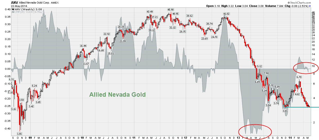
Even Battered Precious Metals Miners Are Being Accumulated These Days

Precious metals sector is really a horrible place to be these days. It seems there is nothing positive on the horizon. But is it true?

Look at the charts below. The charts evidence some heavily battered PM stocks. Most of them are below their this-year bottoms. But one of my favorite indicators, Chaikin Money Flow, shows the relative strength of these stocks. If you look closely at the charts you will spot that this indicator (grey area behind the chart line) is today much higher than at the time when the last bottom was printed. In my opinion, this pattern suggests that somebody is accumulating PM stocks. And this "somebody" is not "weak hands" definitely (weak hands do not accumulate stocks in a strong downtrend).


                                                                              source: www.stockcharts.com


Friday, May 16, 2014

A Simple Strategy For Gold Stocks

Here is a quite simple strategy to play in the precious metals markets.
Assumptions:
  • We play only GDXJ  - this is an ETF consisting of junior precious metals stocks
  • There are only two positions: long GDXJ or short GDXJ
  • a BUY signal is generated when GDXJ over-performs GDX (big precious metals producers) - then we have LONG positions
  • the SELL signal is generated when GDXJ under-performs GDX - then we have SHORT position

Let us look at the chart below, which evidences this play:


Having played this strategy since August 2013 one could win 31.5 points (or $31.5 per one GDXJ share). This means a gain of 84%.
Presently there is a signal: go LONG GDXJ.


Wednesday, May 14, 2014

A Quick Look at the U.S. Stock Market

An interesting situation in the U.S. Some indices are in strong uptrends but some are developing reversal patterns:

                                                                           source: www.stockcharts.com

Wednesday, April 23, 2014

Looking For a Bottom In Precious Metals Shares

Firstly, the chart:

source: www.stockcharts.com

The chart above evidences four phases of the current precious metals cycle:

Phase 1 - both gold and miners are in an uptrend with miners going up more than gold - this was the strongest phase of the current cycle, which started in 2008

Phase 2 - again, gold and miners in an uptrend but miners loosing momentum (they appreciate in the same way as gold, not faster)

Phase 3 - gold is going up but miners are going down - miners are in a strong downtrend

Phase 4 - gold and miners are consolidating

Well, the most important thing is what is happening today:
  • both gold and miners are not going down - this a big plus for the goldbugs
  • there are trading days (as yesterday) when gold is a little bit down but miners are up - another plus
  • this a consolidation stage and the direction where the prices will go after that is a question mark.
Another plus for the goldbugs is that it seems that Big Money, since 26 March 2014, has started to accumulate miners shares (I will show the Big Money chart later).

Conclusion: the technical situation of the miners shares is presently much better than in 2012 and 2013 with the chances of breaking up from the ongoing consolidation stage slightly higher than the opposite.

Friday, April 18, 2014

U.S. Stock Market - No One Rings the Bell At the Top

In my February 14 post I was looking for a top in the Nasdaq 100 index. Let me remind you the updated chart:

                                                          source: www.stockcharts.com

History repeats but the pattern has changed. Since February 14 the index have gone up a little bit but then....gone down and today it stands about 3% lower than in February 14.

What next? Of course everything could happen but the chart below is a sort of a ringing bell:

                                                                                      source: www.stockcharts.com

The grey area behind the index is the chart of Chaikin Money Flow indicator. Without going into details, this indicator shows whether money goes into stocks or out of stocks. As the chart shows, ahead of any major correction the Money goes out of  stocks - the slope of the indicator is decreasing (green lines). Looking closely at the chart you can see that a major correction is probably on because, despite the top in stocks, the indicator is very close to zero! What is more - due to the extended divergence (which started in May 2013) this could even be the topping pattern of the whole bull run.
The bell is ringing something big.