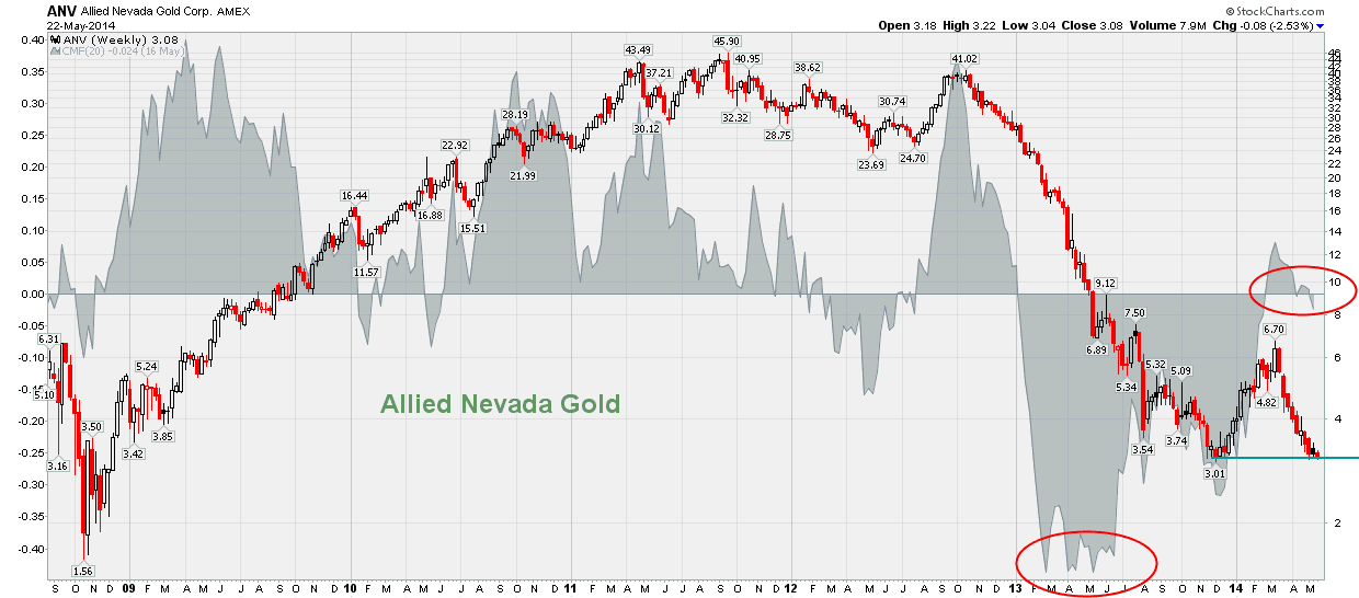
Precious metals sector is really a horrible place to be these days. It seems there is nothing positive on the horizon. But is it true?
Look at the charts below. The charts evidence some heavily battered PM stocks. Most of them are below their this-year bottoms. But one of my favorite indicators, Chaikin Money Flow, shows the relative strength of these stocks. If you look closely at the charts you will spot that this indicator (grey area behind the chart line) is today much higher than at the time when the last bottom was printed. In my opinion, this pattern suggests that somebody is accumulating PM stocks. And this "somebody" is not "weak hands" definitely (weak hands do not accumulate stocks in a strong downtrend).
source: www.stockcharts.com


No comments:
Post a Comment